Showing posts with label analysis. Show all posts
Showing posts with label analysis. Show all posts
Wednesday, 11 March 2015
Tuesday, 20 January 2015
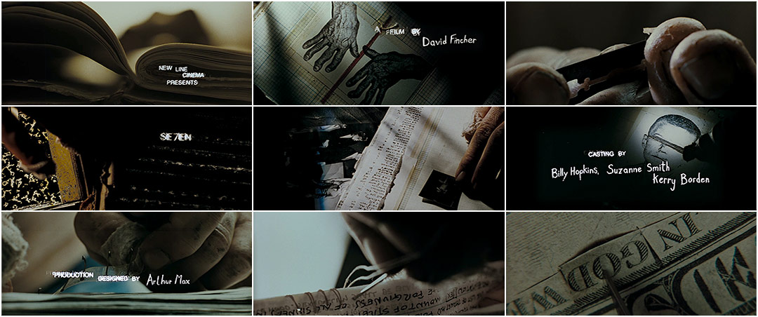
Analysis Of Se7en Title Sequence
The Se7en ( David Fincher,1995) title sequence created by Kyle Cooper is inconic and has inspired many other designers over the years. It can be classed as iconic becuase of how many it has inspired and and how it created a new way of creating title sequences.
The sequence conveys the films psychological thriller genre through its mise-en-scene and STINCS. The sequence is mainly composed of close-up shots of office looking objects, perhaps belonging to someone interested in photography or film, as there are negatives and photographs of injured bodies. The person seems to be methodically creating a book which looks like an artists portfolio. In addition to the post mortem looking photographs there are files which resemble ones of a police investigation, this would suggest the person shown has acess to the police force. However there are also shots of the person cutting their skin off their finger prints. This shows that the person could be on the wrong side of the police force as they are trying to hide their identity. The auidience is never shown the persons location or identity this hightens the tension already built up by the props, cinematography and sound.
The use of sound and typography also adds to the tension and helps convey the suspense thriller genre. The sound is a compliation of white noise, and electric sounds which resemble high pitch screams and the whirring of machines. This provokes an audience response as it creates the mental imagery of people getting harmed, a foreshadowing of what is the come in the film.
The typography in the sequence is two different styles. One of which is a messy handwriting, similar to the handwriting in the book. The other is a classic typed font, both of the fonts are white agaisnt black which can suggest the binary oppositions of good versus bad. Which is part of the main narrative in the film.
The sequence conveys the films psychological thriller genre through its mise-en-scene and STINCS. The sequence is mainly composed of close-up shots of office looking objects, perhaps belonging to someone interested in photography or film, as there are negatives and photographs of injured bodies. The person seems to be methodically creating a book which looks like an artists portfolio. In addition to the post mortem looking photographs there are files which resemble ones of a police investigation, this would suggest the person shown has acess to the police force. However there are also shots of the person cutting their skin off their finger prints. This shows that the person could be on the wrong side of the police force as they are trying to hide their identity. The auidience is never shown the persons location or identity this hightens the tension already built up by the props, cinematography and sound.
The typography in the sequence is two different styles. One of which is a messy handwriting, similar to the handwriting in the book. The other is a classic typed font, both of the fonts are white agaisnt black which can suggest the binary oppositions of good versus bad. Which is part of the main narrative in the film.
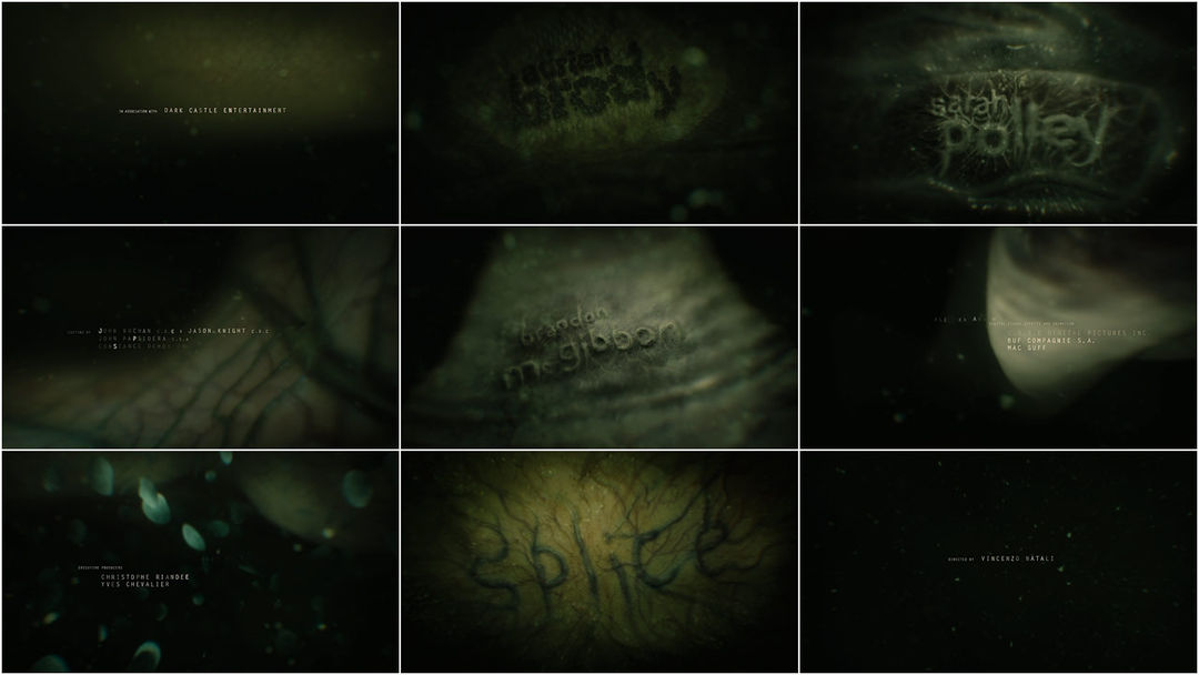
Analysis Of Splice Title Sequence
Splice (Vincenzo Natali 2009) is a science fiction thriller film, the title sequence conveys this through its STINCS. The title sequence is animated and simple, it iscomposed of close up shots of various items, all green hued.
The sequence opens with shots of twitching animals x-rays which fades into murky black and green water, as the camera moves along something which resembles a wall turns out to be the body of a snake but with visable veins. The shot follows the body ans fades out to bubbles and more different skin surfaces. Most of the surfaces are translucent or normal opaque like with the veins visable on top. This helps to convey the science fiction thriller genre as the all the skin and veins provokes the audience to think of animal testing, and the fact that the water is so dark and murky means you cant see where the camera is leading you or what else is in the water. The green hue of all these shots can suggest nature and growth, two main themes of the film as the the experiment of the 'splicing' grows up. The closing shot of the title on skin, shows the skin beating as if it were alive, this could show that the experimenting was succesful.
The typography of the title sequence is part of the images in the shots. All of the actors names are made up of the veins on a section of skin, this can connote of how they are tied to the narrative. The other typography of the crew is a simple classic text partially blurred with the murky water. Neither type of text stands out from what the audience is seeing, this keeps the title sequence thrilling as the audience is forced to focus on the main images.
The soundtrack of the sequence is mainly composed of eerie violin and piono, but is partially muffled as you would hear it underwater, this is parrallell to the images. The music gets more dramatic as the sequence goes on and at the last shot of the moving skin and title a heart beat is heard. This aptly adds to the elements of the science fiction thriller genre.
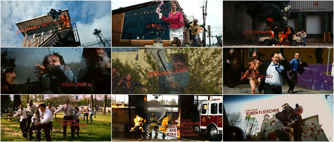
Analysis Of Zombieland Title Sequence
Zombieland (Ruben Fleischer, 2009) is a comedic horror film, these themes are conveyed through the mise-en-scene and STINCS in the title sequence. The sequence is narrated, the voice narration sets up the auidience for part of the narrative as the the narrator is the main protagonist.
The sequence consists of shots of everday events being crashed by zombies, which shows the horror element and the antagonists of the film.The iconography includes the usual conventions of a horror such as blood, gore and people experiencing terror, also the narrator tells the audience that America is overrun by the zombies and that he is on of few possible survivors. This shows that the terror is widespread and apocolyptic.
However there are elements present which show the films comedic genre. The events that are being crashed by the zombies are comical, these are things such as a business man being chased by a zombie stripper out of a strip club, a zombie bride attacking her groom at the alter and a over weight man trying to run away from a zombie on a football field. These situations are ironic and in slow-motion which further adds to the comdey for the audience.
The typography of the sequence is red, this is part of the iconography with the blood and can represent anger and violence. The typography moves with whats happening on screen, for instance when a car window is smashed the letters move as if they are pieces of glass.
All of the aforementioned elements partnered with the voice over's rule's on how to survive the zombie apocalypse such as 'rule #1 cardio' and the rock song soundtrack the title sequence aptly conveys the comedy horror genre to the audience along with a hint as to the characters and narrative.
Analysis Of The Game Title Sequence
The title sequence of The Game (David Fincher, 1997), a mystery thriller which conveys the genre through its STINCS, is a compliation of a home video with a piano piece soundtrack. The production logos are included in the title sequence as they turn into puzzle pieces with flowing water sounds, one of the elements featured in the title sequence, water, is present from the begining.
The sequence shows rich family life as they prepare and host a childs birthday party in what looks like a 1950's setting, a older man who the audience can assume is the childs father looks uninterested by the goings on around him as the happy looking adults engage in conversation. There is also a shot of his silhouette smoking inside by a window. In a title sequence shots of the young boy and his father in the same position by a hedge appear four times, once at the beginning then dotted throughout. On the third time the father gives the boy a model boat and on the fourth he walks into the darkness behind them. This could connote that the father will leave this life he shares with his family and leaves the boy with darkness in his place. These elements help create the thriller mystery genre as there are no identitys given to the many characters shown and the audience can't be sure of who else will be a main character.
There are two pools in the garden setting, one by the tables and tents and the other further back. They are explicitly shown twice throughout the sequence and are in the background of other shots, this makes water constantly present. The first time water is explicitly shown is a shot of the model boats on the closest pool, one of the boats is the one the boys father gives him. The other time is when a boy gets pushed in the other pool by a group of boys who get told off by a woman, the audience can assume that the boy pushed in is the main boy. Without seeing the film the audience can already infer some of the themes of the film such as family conflict and a fear of clowns which in the film will be part of the actual game where the thriller parts of the film are. The final two shorts are of the boy smiling and a womans hands fussing over his hair with a warm sepia effect over it which cuts to the boy as a wrinkled middle aged man splashing water over his face. The man has no emotion and the room around him seems metal like and cold, which is a stark contrast to the shot before.
There is no typography and very minimalistic sound during the title sequence, this could be because the director and designer wanted the audience to focus and take notice of the significant deatails on screen. This helps create the mystery thriller genre in the sequence as the piano music paired with the grainy footage is quite eerie.
Subscribe to:
Posts (Atom)