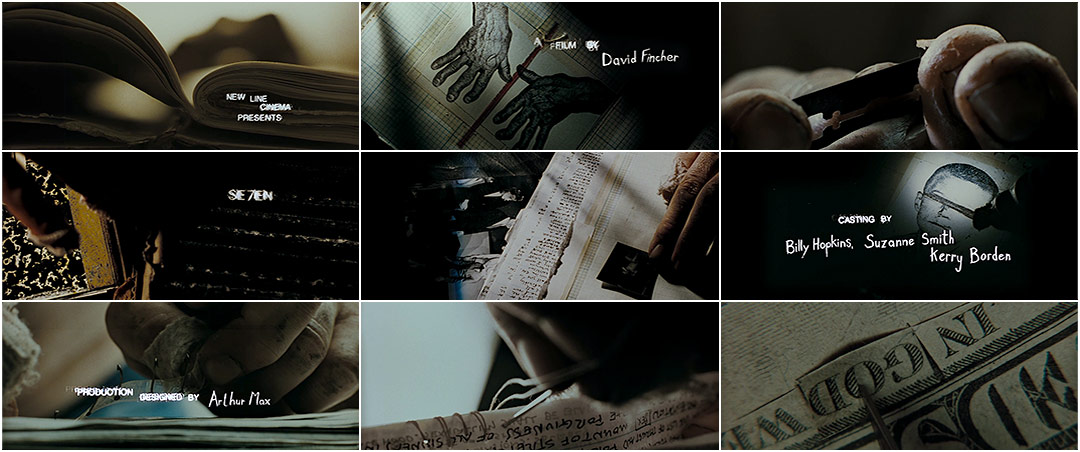
The sequence conveys the films psychological thriller genre through its mise-en-scene and STINCS. The sequence is mainly composed of close-up shots of office looking objects, perhaps belonging to someone interested in photography or film, as there are negatives and photographs of injured bodies. The person seems to be methodically creating a book which looks like an artists portfolio. In addition to the post mortem looking photographs there are files which resemble ones of a police investigation, this would suggest the person shown has acess to the police force. However there are also shots of the person cutting their skin off their finger prints. This shows that the person could be on the wrong side of the police force as they are trying to hide their identity. The auidience is never shown the persons location or identity this hightens the tension already built up by the props, cinematography and sound.
The typography in the sequence is two different styles. One of which is a messy handwriting, similar to the handwriting in the book. The other is a classic typed font, both of the fonts are white agaisnt black which can suggest the binary oppositions of good versus bad. Which is part of the main narrative in the film.
No comments:
Post a Comment